Designing an open-source design system, with Claude as my build partner
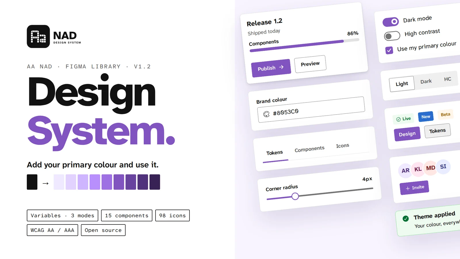
Aa NAD is a universal, monochrome, accessibility-first design system for web and mobile. I designed and shipped it end to end: code, docs and a Figma Community library anyone can use.
Snapshot
Aa NAD is written so designers, developers and AI coding agents can all follow it. The idea is “bring your own brand”: the base is monochrome, and swapping 11 primary-colour tokens recolours every component. I set the direction and made every design decision; Claude was my engineering partner for the build, contrast testing, interaction tests and a Figma plugin that generates the library from code. One source of truth, published to GitHub Pages and Figma Community, and still growing every week.
Counted from the repo and the Figma file at v1.2.1.
The problem
Most design systems are a Figma file or a code library, rarely both, and almost never written for the AI agents that now write a lot of UI. Four gaps kept showing up:
Figma and code drift apart the week after handoff. Every fix has to be made twice, and usually only gets made once.
Contrast checked by eye, states missing, keyboard and screen-reader behaviour left for developers to guess.
Free kits ship a brand of their own. Re-theming means detaching components and repainting by hand.
Docs are written for humans who skim. An AI coding agent needs rules it can follow without guessing.
so the brief: one system, one source of truth, readable by people and machines.
What success looked like
- One source of truth. Figma is generated from code, so the two can’t drift
- Accessibility checked in code. every colour pair tested, every state and keyboard path defined
- Complete, not just pretty. cover every core component on designsystemchecklist.com
- Bring your own brand. swap 11 primary tokens and every component recolours
- Usable on day one. load the tokens, the stylesheet and the bundle, no build step
- Rules an agent can follow. plain-language guides with token names and do / don’t examples
Who it’s for
Three kinds of people (and one kind of not-person) read a design system. I wrote for all of them at once.
Variables in three modes, text and shadow styles, component sets with variants and swappable icons.
Tokens as CSS, 45 components with every state, keyboard support and screen-reader behaviour.
Guides that say exactly which token, which component and which state to use, so output stays on-system.
If an AI agent can follow the docs without guessing, a new developer can too.
Me on direction, Claude on the build
I treated Claude (Cowork and Claude Code) as an engineering partner, not a generator. I set the direction and made every design decision; Claude built, tested and wired it up, and I reviewed every step.
- 01The brief, scope and benchmark
- 02Every design decision: colour, type, grid, motion, logo
- 03Component behaviour, states and content rules
- 04Reviewing every build and calling what ships
- 01Building the tokens and React components
- 02Contrast testing every colour pair in code
- 03Interaction and keyboard tests
- 04The Figma plugin that generates the library
Component sets came out as loose frames until the plugin grouped them by property.
Strokes weren’t scaling with the shapes, so every icon filled in. Fixed in the plugin, so all 98 at once.
Wrapped text boxes pushed into the content below. Fixed so layouts reflow.
Three rules, six decisions
A 12-hue palette and semantic colours sit behind a neutral UI. The 11-step primary ramp is the only brand colour.
Chosen over Roboto for legibility: letterforms that can’t be confused, at every size.
One rhythm for spacing, sizing and radius, so layouts line up without thinking.
Every colour pair checked in code. High contrast meets WCAG AAA (7:1) with visible borders and a 3px focus ring.
Hover and press, controls, enter and exit, loading. All of it respects reduced motion.
Outline at rest, filled when active. 15 black-and-grey line illustrations and 8 illustrated avatars.
What shipped
Version 1.2 is a complete, working system: tokens, components, guides and a Figma library, all from one repo.
Trade-offs & decisions
the safe choice was always there. I mostly didn’t take it.
Roboto is everywhere and safe. Atkinson was built for legibility, which is the point of an accessibility-first system.
→ legibility over familiarity.A colourful default looks better in a screenshot, but forces everyone to repaint it.
→ your brand, not mine.Building the file by hand is faster on day one. Generating it took a plugin and real bug fixing.
→ one source of truth wins by week two.Two logo directions, each with a full kit. Module builds the letters from 8px-grid blocks, the same grid as the system.
→ the logo is made of the system.The impact
Counts come from the repo and the Figma file at v1.2.1. This is a self-initiated project, so there are no adoption numbers yet; I’ll add them here as the community file grows.
Looking back
“A design system is a list of decisions you only want to make once. Writing them for an AI agent made me make them properly.”
Working with Claude changed what one designer can ship: I stayed on direction and decisions while the build, the contrast maths and the Figma plugin moved at engineering speed. The hard parts were still mine. A disabled switch that read as “off”, an icon set that rendered as squares, a logo that had to earn its place. Next, I want real feedback from people using the community file, and their contributions back into it.
The setup
Still shipping
this section grows every week, as the system does.
- v1.2.1LATEST
Figma plugin builds a new cover from live components. Fixed icons rendering as solid squares and wrapped text overlapping.
- v1.2.0
Figma library builder plugin. Open-sourced under MIT and CC BY 4.0 with a GitHub Pages site. New FileUpload. Disabled Switch redesigned.
- v1.1.0
High contrast theme (WCAG AAA). Combobox, MultiSelect, BlockLoader. Calm and precise motion across every component.
- v1.0.0
First release: tokens, 41 React components, the Module Aa logo, Ionicons, illustrations, avatars and the first guides.